Micro-interactions are small, subtle animations or effects that provide instant feedback to users when they interact with an interface. They enhance the user experience by making interactions more engaging and intuitive.
Examples include the typing indicator in online chats, download progress bars, and page refresh loading indicators.
Buttons are a common interactive element on websites, used for various tasks like toggling, submitting, deleting, closing, and selecting (via radio buttons, option buttons, or select menus).
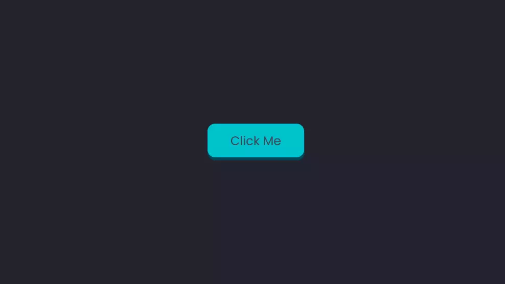
Bouncy 3D Micro-interaction
We can use the CSS transform property to create a 3D button that bounces when clicked. The image below shows the desired effect.
Here’s the HTML for this button:
<body>
  <button class="btn"><span class="text">Click Me</span></button>
</body>
For this example, we’re nesting a <span> element within the <button> to create a distinct 3D effect. While not typically necessary for buttons, the <span> will hold the “Click Me” text, forming the top part of the button.
The <button> has the class name btn, and the <span> holding the text has the class name text.
Here’s the CSS for the button:
.btn {
  position: relative;
  background: #004958;
  border-radius: 15px;
  border: none;
  cursor: pointer;
}

.text {
  display: block;
  padding: 15px 45px;
  border-radius: 15px;
  background: #00c2cb;
  font-size: 1.5rem;
  font-weight: 500;
  color: #42455a;
}
The following screenshot shows what it looks like at this point.
To create the sides of the button, we’ll use the transform property to move the text upwards, creating a 3D effect.
We’ll then animate this property by changing its translate value vertically along the y-axis, creating the bouncy effect when the button is clicked (:active state):
.text {
  display: block;
  padding: 15px 45px;
  border-radius: 15px;
  background: #00c2cb;
  font-size: 1.5rem;
  font-weight: 500;
  color: #42455a;
  transform: translateY(-6px);
  transition: transform ease 0.1s;
}

.btn:active .text {
  transform: translateY(-2px);
}
Adding a Clicking Sound to a Button
Sound can enhance micro-interactions, similar to the clicks of a physical mouse button. For users with tablets and mobile devices, audio feedback can be particularly helpful.
Here’s the HTML for the button:
<button>Click Me</button>
For this example, the styling isn’t important. To replicate the sound of a physical button click, we’ll use JavaScript to create an Audio object and specify the source of the clicking sound:
var mouseclick = new Audio();
mouseclick.src = "/click.wav";
This sound is going to play when the user clicks on the button. For this to happen, we’ll add an onmousedown event to the button:
<button onmousedown="mouseclick.play()">Click Me</button>Note: we can’t name the audio object click, because it’s a reserved word and can’t be used as a variable name.
The following CodePen demo shows our clicking button in action.
Buttons with Border Animations
There are several ways to animate the border of a button, so we’re going to look at a few examples.
Simple Border Micro-interaction
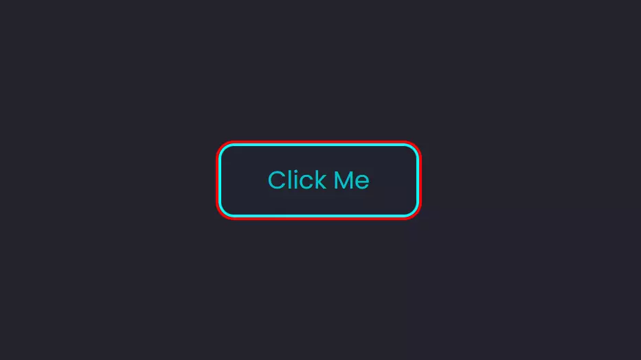
Let’s start with something simple. Normally, we’d use the border property to add a border to an element. However, CSS also offers the outline property, which is similar but provides an outline around the element, rather than within its boundaries.
Both properties are declared the same way. Here’s an example of a button with both an outline and a border:
button {
  border: 3px solid cyan;
  outline: 3px solid red;
}
The screenshot below shows what this looks like.
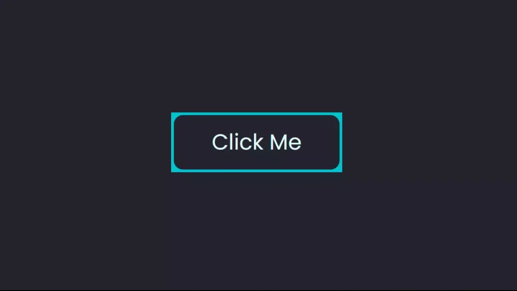
Outline Properties and Micro-Interactions
Outlines don’t affect the dimensions of the main element (like a button) and can overlap other content or elements. To adjust their position, we can use the outline-offset property.
A positive outline-offset value moves the outline outwards, away from the border. A negative value does the opposite. To hide the outline, set it to the negative value of the border’s width.
We’ll animate this property to create a micro-interaction for our button:
button {
  border: 2px solid #00c2cb;
  outline: 2px solid #00c2cb;
  outline-offset: -2px;
  transition: outline-offset 200ms ease;
}

button:hover {
  outline-offset: 3px;
}
The button is essentially sprouting a second border. It makes for a simple micro-interaction.
The following Pen shows this in action.
Button Hover Effects with Pseudo-Elements
Let’s explore a more complex micro-interaction using the ::before and ::after pseudo-elements, along with the inset property, to create visually appealing border animations.
The image below illustrates the desired effect for this button micro-interaction:
We’ll set up our styles step by step, starting with the main <button>:
button {
  position: relative;
  background: transparent;
  padding: 15px 45px;
  border-radius: 15px;
  border: none;
  font-size: 1.5rem;
  color: #e0ffff;
  font-weight: 500;
  cursor: pointer;
  overflow: hidden;
  z-index: 1;
}
The inset property pushes an element away from its parent element horizontally and vertically:
button::before {
  content: '';
  position: absolute;
  inset: 0px 50px;
  background: #42455a;
  transition: inset 350ms ease;
  z-index: -1;
}
The inset was first added to the ::before pseudo-element for this button. It has a value of 0px 50px, so it will only apply to the y-axis.
Here’s how the button will look at this point with just the ::before element:
Next, we add the ::after pseudo-element:
button::after {
  content: '';
  position: absolute;
  inset: 3px;
  border-radius: 10px;
  background: #22232e;
  z-index: -1;
}
This ::after pseudo-element will cover the ::before pseudo-element, leaving a gap the size of the inset and thus creating a border.
The image below shows what the button will look like at this point when we hover over it.
To get the final look, we’ll add overflow: hidden to the main <button> element. This will remove the square corners and complete this button’s micro-interaction.
The following Pen provides a live example.
Border Animation on a Round Button
To create a border animation on a round button, set the border-radius to 50% and ensure equal height and width. Using the same method as before, here’s the CSS:
button {
  background: #42455a;
  width: 80px;
  height: 80px;
  border-radius: 50%;
}

button::before {
  content: '';
  position: absolute;
  inset: -1px 30px;
  background: #00c2cb;
  transition: 500ms;
  animation: rotate 4s linear infinite;
  z-index: -1;
}

button:hover::before {
  inset: -1px;
}

button::after {
  content: '';
  position: absolute;
  inset: 3px;
  border-radius: 50%;
  background: #22232e;
  z-index: -1;
}
The following screenshot shows how things look so far.

We’re using the same effect as the previous example, so the border will become blue once we hover over the button.
At this point, we can make a slight variation by rotating the ::before pseudo-element using CSS animation:
We’re retaining the same effect as the previous example, causing the border to turn blue on hover. To add a subtle variation, we can rotate the ::before pseudo-element using CSS animation:
@keyframes rotate {
  0% {
    transform: rotate(0deg);
  }
  100% {
    transform: rotate(360deg);
  }
}
The Pen below shows the final result for this button micro-interaction.
Ripple Micro-interactio
To create a ripple effect when the button is clicked, we’ll use JavaScript. Here’s the JavaScript code, along with the necessary styling for the button:
let btn = document.querySelectorAll("button");
btn.forEach((btn) => {
  btn.onclick = function (e) {
    let x = e.pageX - e.target.offsetLeft;
    let y = e.pageY - e.target.offsetTop;
    let ripples = document.createElement("span");

    ripples.style.left = x + "px";
    ripples.style.top = y + "px";
    this.appendChild(ripples);

    setTimeout(() => {
      ripples.remove();
    }, 2000); /*1000 = 1s*/
  };
});
The click function records the x and y coordinates of the mouse click and generates a new <span> element. Each <span> stands for a ripple effect, and the setTimeout() method is employed to remove it after two seconds. (For further details on setTimeout(), refer to the “setTimeout JavaScript Function: Guide with Examples.”)
Following this is the CSS section. We’re styling the ripples and applying CSS animation to modify their size and transparency, resulting in the ripple effect.
Below is the CSS code for the <span> element:
button span {
  position: absolute;
  background: #004958;
  transform: translate(-50%,-50%);
  pointer-events: none;
  border-radius: 50%;
  animation: ripple 2s linear infinite;
  transition: 0.5s;
}

@keyframes ripple {
  0% {
    width: 0;
    height: 0;
    opacity: 0.5;
  }
  100% {
    width: 500px;
    height: 500px;
    opacity: 0;
  }
}
The CodePen demo below illustrates the final outcome.
Note: In the CodePen demo above, overflow: hidden is applied to the main <button> element to prevent the ripples from extending outside the button’s boundaries.
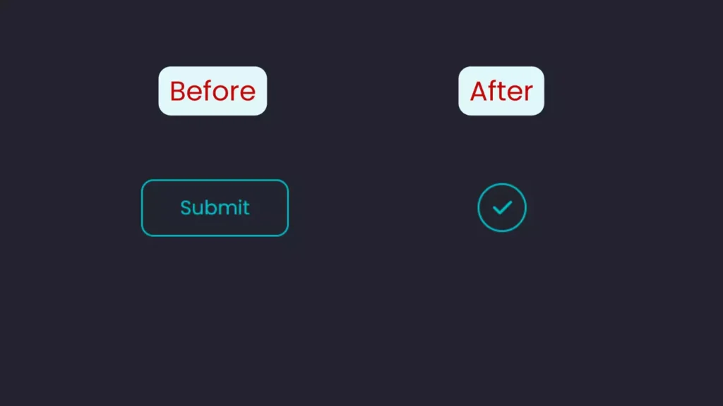
Shape-shifting Micro-interaction
Transforming a button into a different shape creates an engaging micro-interaction. This can be a great way to confirm a successful submission.
The screenshot below illustrates our goal.
As always, we’ll start by styling the main <button> element. For this example, we’re adding a check icon from Font Awesome:
<button>
  Submit
  <i class="fa-solid fa-check"></i>
</button>
Here’s the CSS:
button {
  position: relative;
  padding: 15px 45px;
  width: auto;
  display: flex;
  justify-content: center;
  align-items: center;
  font-size: 1.5rem;
  border-radius: 15px;
  border: 2px solid #00c2cb;
  background: none;
  color: #00c2cb;
  cursor: pointer;
  outline: none;
  transition: 200ms;
}

i {
  position: absolute;
  color: transparent; /* To hide the check icon */
  transition: 200ms;
}
Next, we’ll modify the button into a circular shape, replace the text with a check icon, and incorporate a spinning loading animation. All of these actions will be triggered by clicking the button.
Here’s the CSS to transform the button’s shape:
button:focus {
  color: transparent;
  outline: none;
  border: 2px solid transparent;
  border-radius: 50%;
  width: 50px;
  height: 50px;
  padding: 25px 25px;
  border-left: 2px solid #00c2cb;
  animation: spin 2s 500ms forwards;
}
Setting equal height and width for the button along with border-radius: 50% will turn it into a circle. The border-left property is applied to create the loading animation.
Below are the @keyframes for the spinning loading animation, where we’ll use the transform property:
@keyframes spin {
  80% {
    border: 2px solid transparent;
    border-left: 2px solid #00c2cb;
  }
  100% {
    transform: rotate(720deg);
    border: 2px solid #00c2cb;
  }
}
Finally, the check icon will appear, but only after the spinning animation completes. This introduces a delay. We can set this delay using the animation-delay property in CSS, or by adding a second time value to the animation shorthand property. The first value will always represent the animation duration:
button:focus i {
  animation: check 300ms 2300ms forwards;
}

@keyframes check {
  to {
    color: #00c2cb;
  }
}
And that concludes our exploration of this button micro-interaction. We can adjust the delays and durations to achieve the desired synchronization.
The CodePen demo below showcases the final outcome.
Combining Button Micro-interactions
Each example stands well on its own, but we can merge some of them to create even more micro-interactions. For instance, the bouncy button can be paired with a clicking sound that aligns with the button’s purpose, such as a notification bell. Additionally, a shake animation can be incorporated into the submit button to signal that the action is denied or invalid.
What other combinations can you come up with?
The Benefits of Micro-interactions
Micro-interactions are more than just stylish effects; they significantly enhance user experience. Here are several reasons why micro-interactions are beneficial for your websites.
As mentioned at the beginning of this article, micro-interactions deliver immediate feedback. Imagine clicking a submit button and experiencing no response; it becomes impossible to determine whether the action was successful. Incorporating micro-interactions makes your website more engaging.
Moreover, beyond buttons, when transitioning to a new page or initiating a download, and in various other scenarios, the absence of micro-interactions would render your site uninspiring. For further insights, check out An Introduction to the View Transitions API to discover innovative ways to provide micro-interactions for your visitors.
Conclusion
We’ve explored how to create ten micro-interactions for buttons. We began with a 3D bouncy button and then progressed to incorporating sound and animating borders. We also discussed adding a ripple click effect to a button, along with altering its shape, text, and icon. Finally, we concluded by implementing a glow-up effect on hover.
It’s essential to maintain simplicity: every micro-interaction should serve a purpose. As we’ve seen, some of these interactions involve considerable coding, so it’s advisable to use them judiciously. Simplicity is key.
You can experiment with combining some of these techniques to create additional micro-interactions.
Frequently Asked Questions (FAQs) about Button Micro-Interactions
What are Button Micro-Interactions?
Button Micro-Interactions are subtle animations or design features that occur when a user interacts with a button on a website or application. They aim to provide visual feedback, enhancing the overall user experience. For instance, a button might change its color, shape, or size upon clicking, indicating that the user’s action has been recognized and is being processed.
Why are Button Micro-Interactions important in web design?
Button Micro-Interactions are vital for enhancing user experience. They offer immediate feedback, making the interface feel more responsive and intuitive. They can also guide users through the interface, facilitating easier navigation and usage. Additionally, they can infuse a sense of creativity and personality into a website or application, making it more engaging and enjoyable to interact with.
How can I implement Button Micro-Interactions in my website or application?
To implement Button Micro-Interactions, you’ll need a mix of design and coding skills. Design the interaction to be visually appealing and intuitive, then code it using HTML, CSS, and JavaScript. Various libraries and tools can simplify this process, such as Animate.css, Hover.css, and GreenSock.
Can Button Micro-Interactions improve website conversion rates?
Yes, Button Micro-Interactions can enhance website conversion rates. By making the interface more engaging and intuitive, they encourage users to interact more with the site, increasing the likelihood of completing desired actions, like making a purchase or signing up for a newsletter.
Are there any best practices for using Button Micro-Interactions?
Yes, several best practices should be followed when using Button Micro-Interactions. They should be subtle and not distract from the main content. Additionally, they should provide meaningful feedback and enhance the user experience while remaining consistent with the overall design and branding of the website or application.
Can Button Micro-Interactions affect website performance?
Improper implementation of Button Micro-Interactions can potentially impact website performance. They may increase load time and resource usage, especially if complex or numerous. Therefore, optimizing them for performance is crucial, ensuring they are lightweight and efficient.
How can I test the effectiveness of my Button Micro-Interactions?
You can evaluate the effectiveness of your Button Micro-Interactions through user testing, which involves observing users as they interact with your website or application and gathering feedback on their experience. Analytics tools can also help track user behavior and measure the interactions’ impact on user engagement and conversion rates.
Can Button Micro-Interactions be used on mobile devices?
Yes, Button Micro-Interactions can be implemented on mobile devices, although they may need adjustments for smaller screens and touch interfaces. For example, hover effects that function well on desktop might not be suitable for mobile, as there is no cursor to trigger them.
What are some common examples of Button Micro-Interactions?
Common examples of Button Micro-Interactions include buttons that change color or shape when clicked, buttons that animate to display loading progress, and buttons that morph into other elements, such as forms or dialog boxes.
Where can I find inspiration for Button Micro-Interactions?
Many online resources offer inspiration for Button Micro-Interactions, including Dribbble, Behance, and CodePen. Observing popular websites and applications can also provide insights into how they utilize micro-interactions.