
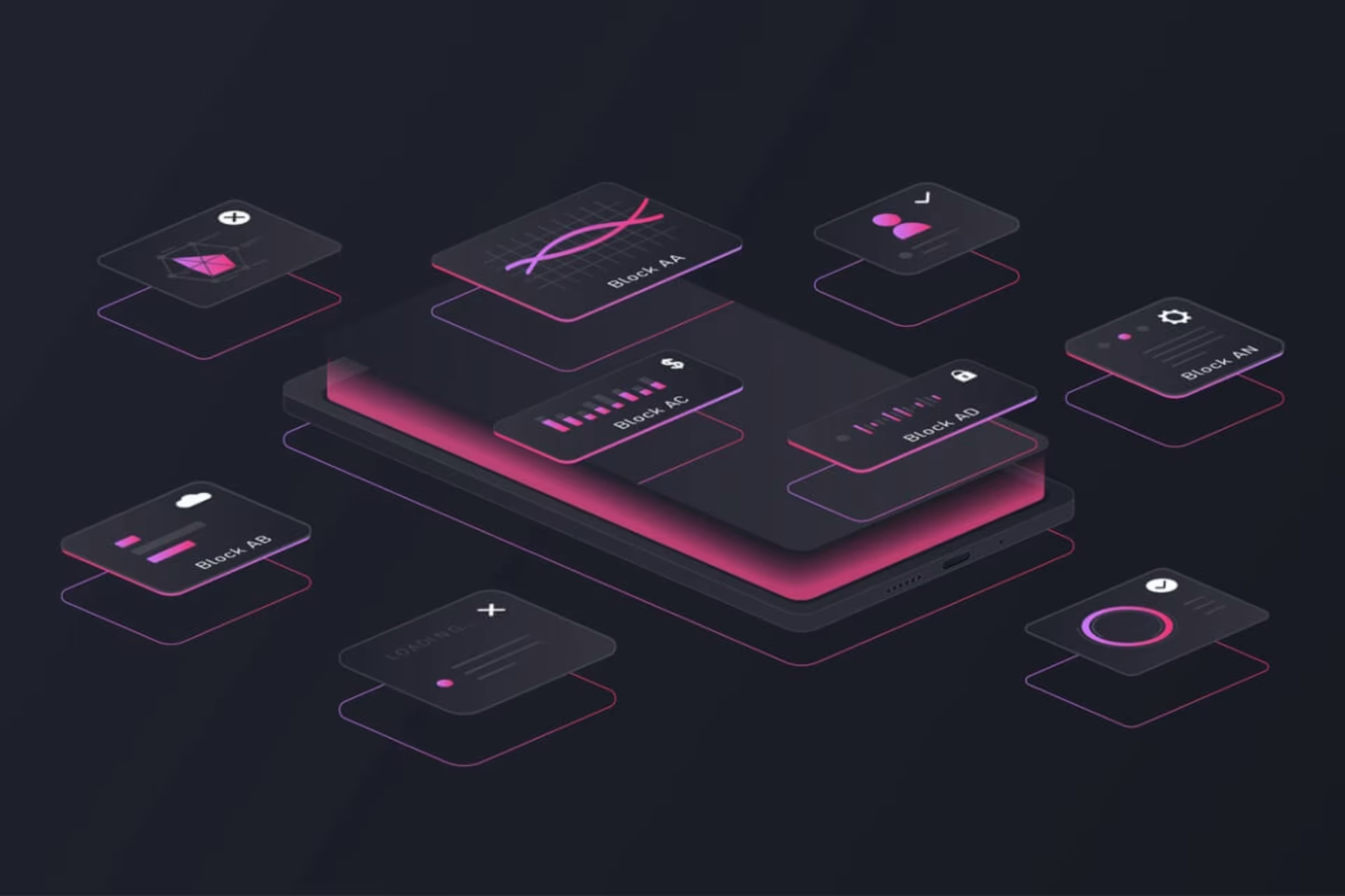
Telerik’s Progress Design System
Telerik’s Kendo UI component libraries have gained significant popularity in the development community, particularly as demand for user interface (UI) design continues to rise. What sets Telerik apart is its approach to UI styling, designed to cater to both developers and designers alike. This ensures that development teams can deliver projects on time without being weighed down by UI challenges.
What makes Progress stand out from the competition is its emphasis on enhancing team collaboration. The design system provides themes, tools, and comprehensive documentation to cover a wide array of design needs. For those new to the system, a helpful guide is available to get started.
Many Telerik and Kendo UI users are back-end developers who often lack the time or expertise for complex UI styling. At the same time, designers working with developers can use integrated tools to contribute more efficiently to the design process. Progress addresses both of these use cases in its combined design and development approach.
About Design Systems
A design system helps ensure that a team delivers a consistent, user-friendly, and intuitive UI, which is critical to maintaining the look and feel of an application.
The success of any application, whether for internal use or for customers, hinges on meeting UI design standards. If the user interface isn’t cohesive, pleasant, and easy to navigate, users will be less inclined to enjoy the experience. Moreover, inconsistent or confusing UIs increase the support burden and associated costs.
Even the most innovative application can fall short if users struggle with a subpar UI. Time, resources, and expertise are often the hurdles. Developers frequently find themselves spending valuable time perfecting CSS, when they’d rather be focusing on functionality and core development tasks. Design teams may provide mockups, style guides, or even a complete design system, but the back-and-forth over CSS adjustments between designers and developers can turn the process into a time-consuming challenge. Even well-planned projects can quickly go off track due to rework and design misalignment.
The Progress Design System offers a solution, even for teams without dedicated design input. Full-stack developers, who may lack the skills for advanced UI design, can use the system to create high-quality interfaces with minimal effort.
Progress’s solution to these challenges is the Progress Design System kit.
Let’s explore what this design system brings to the table.
Out-of-the-Box Themes
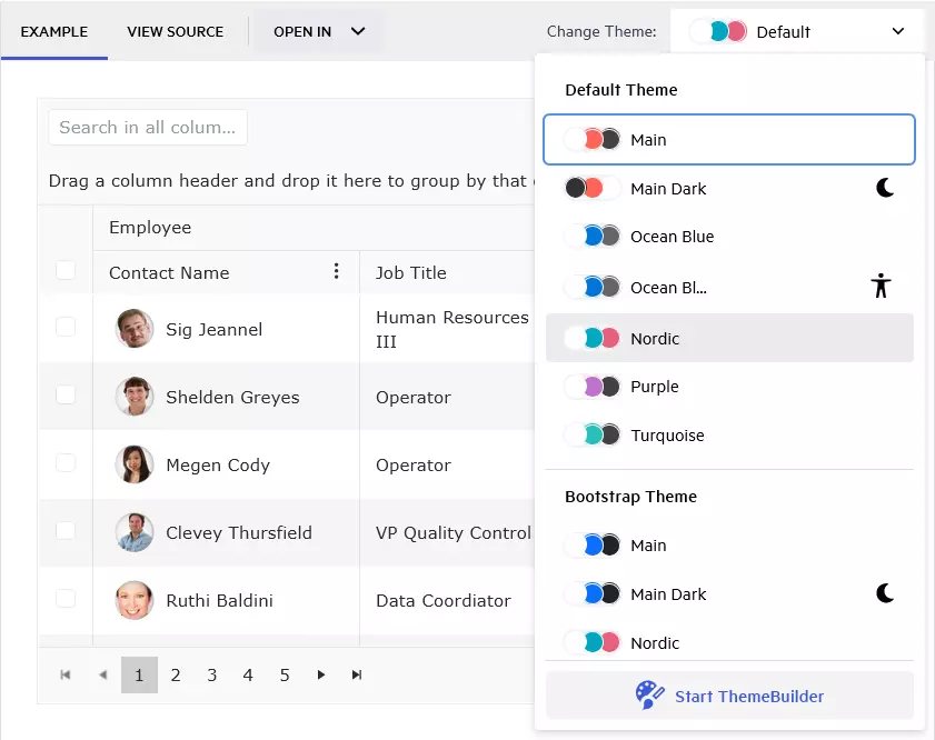
The Kendo UI component libraries come equipped with four professionally crafted themes: Default, Material, Fluent, and Bootstrap. Both developers and designers can select any of these themes, which will then be consistently applied throughout the project. This provides the simplest route to achieving a great user interface when no customizations are required.
- Default: Features neutral styling based on the Telerik and Kendo design system.
- Bootstrap: Aligns with the widely-used Bootstrap framework.
- Material: Adheres to Google’s Material Design principles.
- Fluent: Implements Microsoft’s Fluent Design System.
These themes comprise a thoughtfully curated collection of visual attributes, including colors, fonts, and spacing. The well-known design systems such as Material, Bootstrap, and Fluent enable developers to achieve a cohesive appearance effortlessly upon applying a theme.
Telerik’s website offers hundreds of demos to explore. Be sure to switch between themes and color palettes to experience their effects firsthand. For instance, you can check out the various out-of-the-box options available.
CSS-Free Customizations (Basic or Advanced)
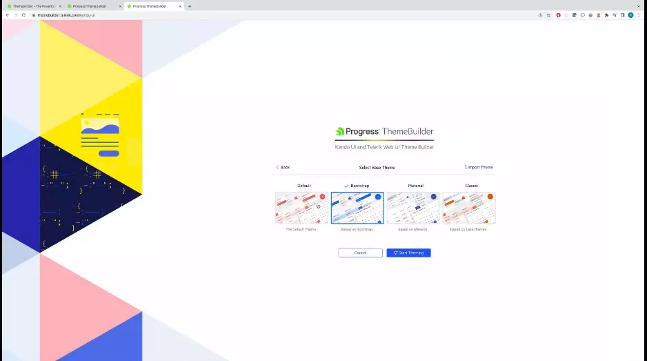
The ThemeBuilder is a powerful design tool that enables developers and designers to make both global and detailed customizations without needing to write complex CSS.
There is virtually no learning curve with the ThemeBuilder, as it operates as a visual tool. Users can style every aspect of their Telerik and Kendo UI components, ranging from the prominent primary color to the most intricate details.
This allows developers to concentrate on delivering rich functionality while designers can craft stunning user experiences that captivate users. Since CSS can be challenging, it’s often best handled by experienced professionals.
With just a few clicks, you can set global properties such as color, border radius, and typography, or switch to advanced mode to customize elements down to the atomic level. The ThemeBuilder is a web application that simplifies component styling.
Once a designer finalizes the project design, sharing their customizations is straightforward and can be done with just a few clicks.
You can explore the ThemeBuilder through a 7-day free trial.
Collaboration Built In
The ThemeBuilder is a cloud-based application that securely stores projects within your account. When team members need to collaborate, they simply log in and access the project, eliminating the need for manual file sharing or source control. This functionality fosters seamless collaboration between designers and developers.
Accessible to both designers and developers, ThemeBuilder centralizes all UI customizations, effectively reducing silos between team members.
Moreover, managers can set specific permissions for each project, enhancing team control. This allows the team to focus on completing tasks without being overwhelmed by irrelevant projects.
DIY for Designers
Typically, once designers hand off their designs to developers, they may lose track of the project. This can lead to numerous back-and-forth exchanges as the application is refined.
ThemeBuilder is code-free and user-friendly, enabling designers to log in and update the actual design themselves, minimizing the need for constant communication. Developers can also be granted access to stay updated with the latest design iterations. This tool helps maintain the momentum of development projects, allowing the team to tackle challenging UI design issues with greater ease.
As Telerik and Kendo UI evolve, designers can keep pace with the latest component features through automatic updates. This ensures that styles are seamlessly adjusted to align with updated HTML, providing a consistent experience while introducing exciting new component features.
Figma Support
Designers can easily incorporate Sass/CSS variables from Figma into ThemeBuilder. Design tokens such as colors, typography, and effects can also be imported.
The ThemeBuilder plugin for Figma allows for the export of:
- Styles: These include colors, typography, and effects as Sass or CSS tokens.
- Custom SVG Icons: These are exported and converted into icon fonts.
To install the plugin for Figma, you only need a Figma account. After that, simply locate the plugin available via Figma’s marketplace and click Install.
To further improve the designer-developer handoff, Telerik and Kendo UI support Figma in two ways:
- Figma UI Kits: Progress offers Figma UI kits that represent every component in the library, allowing designers to create pixel-perfect representations of their envisioned final product.
- Import Design Tokens into ThemeBuilder: Developers can directly obtain design tokens from Figma, streamlining the handoff process between designers and developers.
The Progress Design System is crafted with both designers and developers in mind to minimize unexpected delays in project delivery.
Detailed and Interactive Frontend Documentation
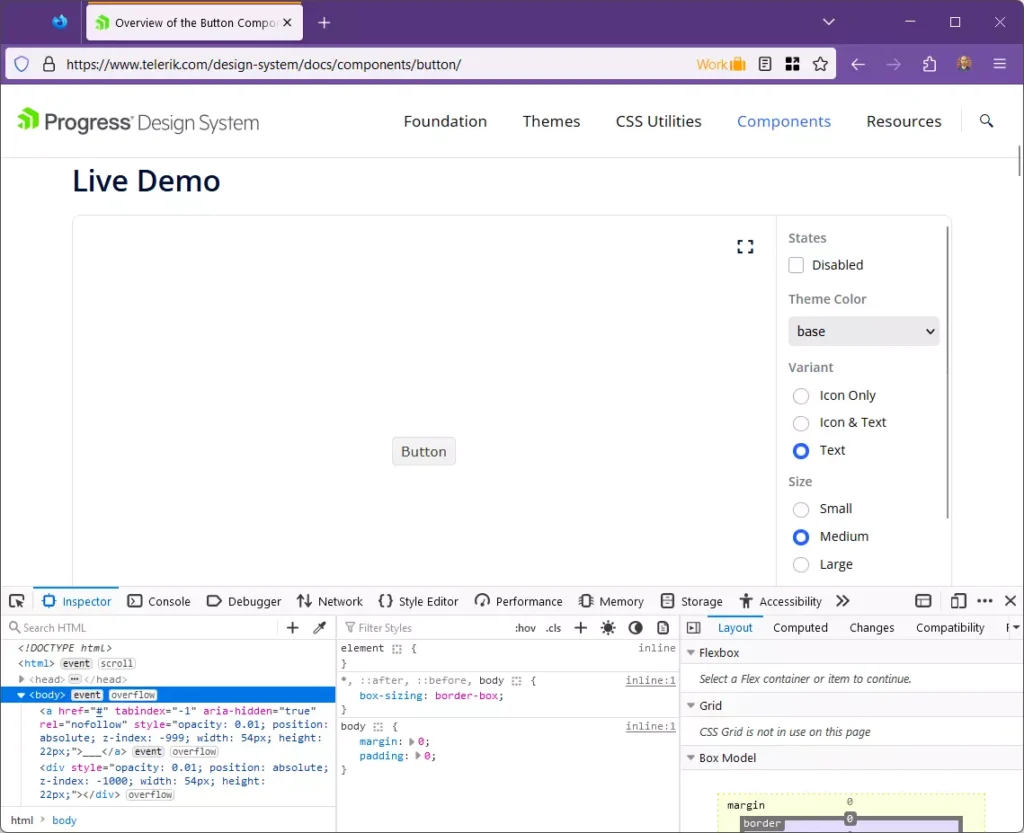
Telerik and Kendo UI offer top-tier documentation that is both detailed and interactive. Developers and designers can explore the Progress Design System comprehensively, gaining insights into markup, styling, and configuration options for each component.
For instance, a developer can easily navigate the documentation, adjust properties, and inspect the resulting markup. For a quick overview, be sure to check out the available documentation for the components.
One notable example is the built-in support for React. Developers can quickly evaluate the markup and available properties, choosing between JavaScript or TypeScript as their preferred markup language.
If React isn’t your preferred framework, other options are available, including Angular, Blazor, jQuery, and Vue. The documentation is thorough, ensuring support regardless of the tool you select.
This approach can significantly enhance the development of backend systems, such as APIs that need to integrate seamlessly with UI designs. For instance, a backend developer can examine the design and start envisioning the structure of the domain data model. With a clear understanding of the domain, they can promptly begin developing other components of the solution, including DTOs, backend storage, and caching mechanisms.
Note: Telerik and Kendo UI are actively working on expanding their documentation, and as of now, not all components are fully covered. The aim is to have comprehensive coverage by 2024.
Transform Your Workflow
For decades, Telerik and Kendo UI have been trusted by developers to deliver exceptional UI experiences. As the demands for UI styling continue to evolve, so do the tools within the Progress Design System. Today, Progress offers a distinctive styling solution that stands out in the marketplace. Whether you require a ready-made option or a fully customized design, this approach provides the easiest path to truly delight your customers.