
Data plays an integral role in contemporary business operations and is essential in our daily decision-making processes. Whether we are presenting data to back our choices or interpreting data from others, effective data visualization is crucial for comprehending the information.
As a data analyst, I have always been enthusiastic about data visualization, continually exploring ways to convey data in a more accessible and comprehensible manner.
However, I have also witnessed how ignoring fundamental principles of data visualization can render data confusing and even misleading.
The advice provided in this article is straightforward yet vital. These tips will help you establish a solid foundation for effective data visualization before delving into more complex techniques.
Use Graphs Whenever Possible
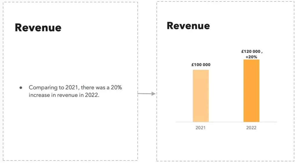
Graphs serve as a powerful means to present data. Instead of showcasing data in plain text or tables, consider transforming it into a graph. This approach makes the information significantly more digestible and easier to interpret. With various types of graphs available, including bar charts, line charts, and pie charts, be sure to select the one that best represents your data.
Make Your Data Stand Out
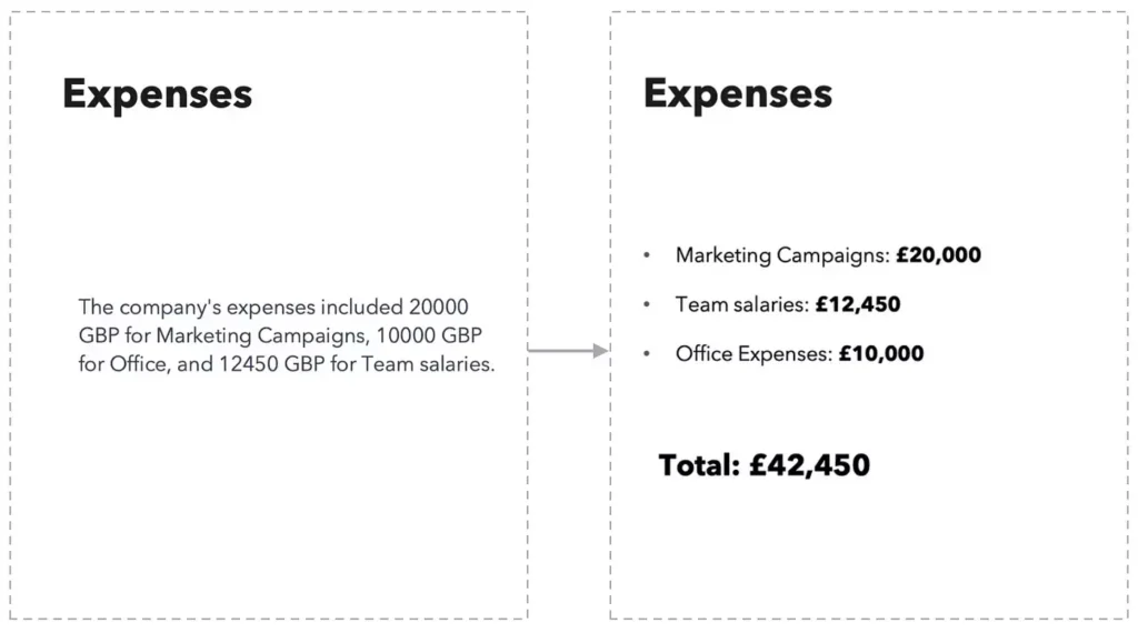
If graphs aren’t an option for presenting your data, consider utilizing bullet points to enhance visibility. To ensure your data stands out, you can employ bold fonts, adjust font sizes, and use commas to separate large numbers into thousands.
Don’t hesitate to emphasize your most significant figures by making them larger and more prominent.
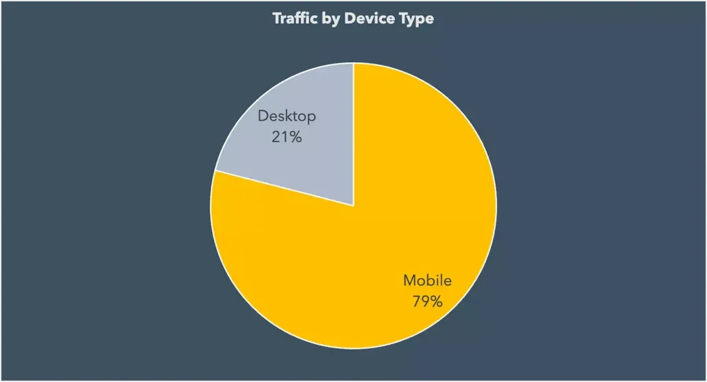
Pie Charts Are Not Always the Best Choice
Pie charts have historically been a favored method for data visualization, but their effectiveness often hinges on the type of data being displayed. While they excel at showing data with two categories, pie charts can become challenging to interpret when more than three categories are involved.
Despite their drawbacks, pie charts can effectively highlight the most dominant category when used correctly. For instance, consider the following chart that illustrates the primary device type responsible for traffic:
However, the next pie chart demonstrates how difficult it can be to discern the highest or lowest shares among categories when too many are included in a single chart:
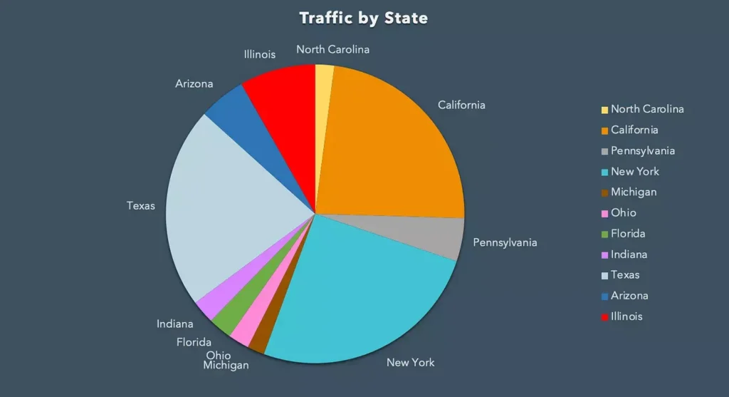
Therefore, if your data encompasses more than three categories, opting for a different type of chart may be a more effective solution.
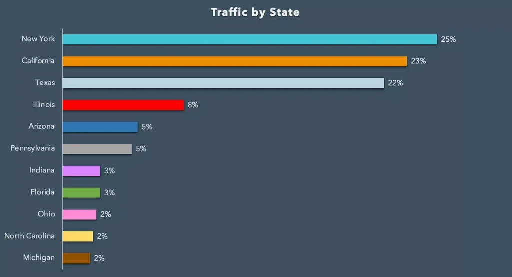
Bar Charts Are Universally Effective
When uncertain about which chart to use, a bar chart is often a reliable option. They excel at displaying a substantial amount of data clearly and concisely. Bar charts provide a strong alternative to pie charts, especially when dealing with more than three categories of data. Ensure you sort your bar chart according to the values you wish to emphasize.
Incorporate Colors
Colors can enhance the engagement and comprehension of your data. Utilize distinct colors to distinguish between categories or to emphasize key data points.
However, exercise caution by not overusing colors, as this can lead to a cluttered appearance in your graph. Instead, consider using different shades of the same color to differentiate between categories. This approach can effectively maintain readability without overwhelming the viewer. Additionally, color coding can aid in navigating through data values.

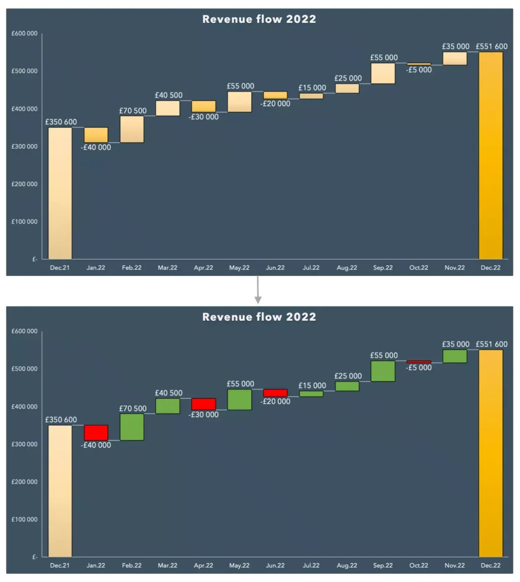
Use Colors Logically
When incorporating colors, ensure they are meaningful in relation to the data you are presenting. For instance, use red to indicate negative data points and green for positive ones.
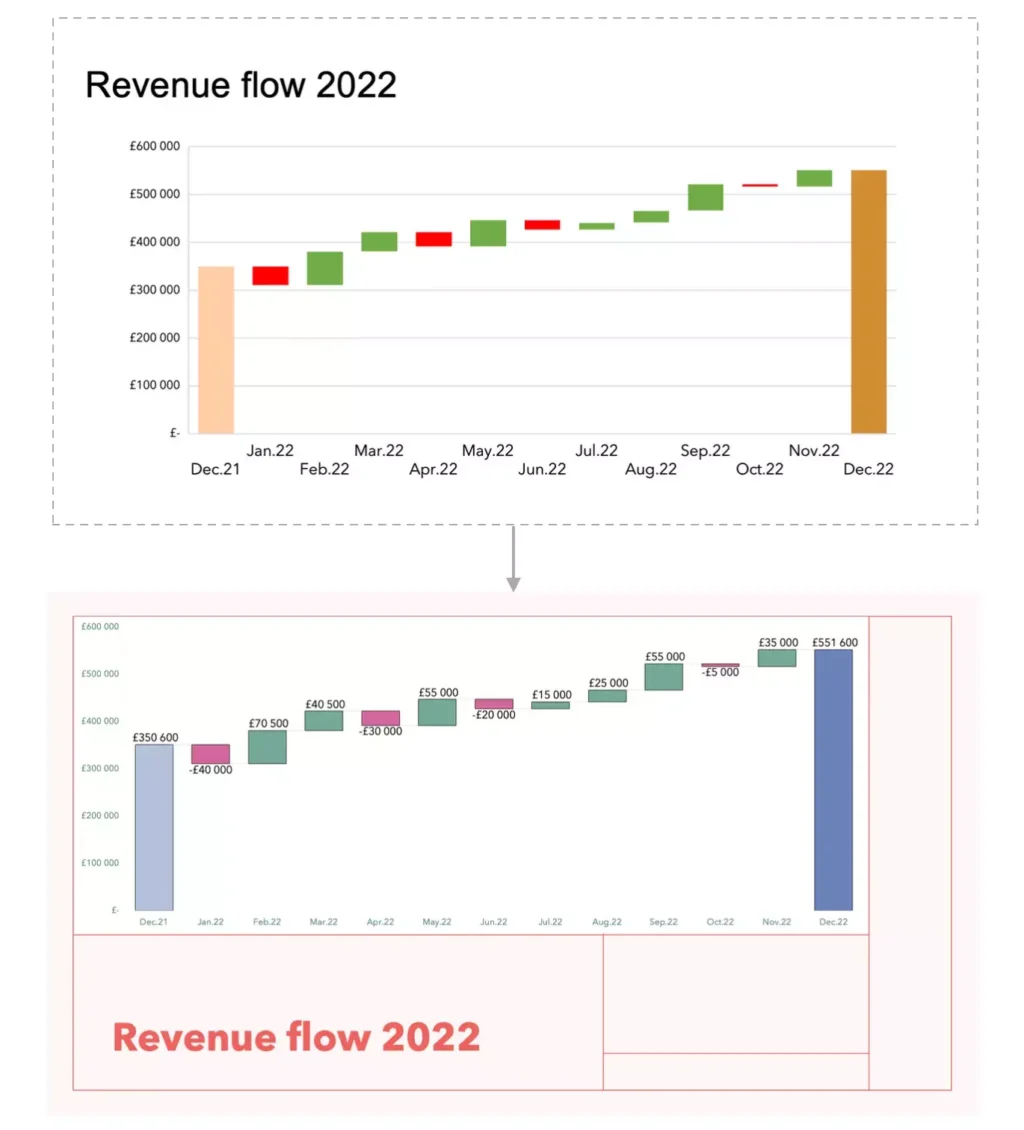
Make Your Visualization Look Polished
Dedicate time to ensuring your visualization appears professional and refined:
- Choose clear fonts and appropriately sized graphs to enhance readability.
- Label your axes and data points clearly, aiding your audience’s comprehension of the information presented.
- Consider customizing default visualization settings for a more tailored look.
- Enhance your graphs with presentation templates, brand colors, and fonts to create a visually appealing design that aligns with your brand identity.
Conclusion
Data visualization is crucial for transforming complex data into clear, trustworthy insights. By adhering to these straightforward tips and techniques, you can craft engaging and effective graphs that enhance your ability to communicate data clearly and effectively. Emphasizing clarity and professionalism in your visualizations will not only aid in understanding but also build trust in the data you present.