
Key Takeaways
- Understand the Benefits: Discover how a React UI component library can streamline and accelerate your development process.
- Explore Popular Options: Familiarize yourself with some of the leading React UI libraries, such as MUI, Ant Design, and React-Bootstrap, and learn what sets each apart.
- Choosing the Right Library: Gain insights on selecting the most suitable UI library for your particular project requirements, whether for mobile applications, desktop software, or websites.
- Customization and Flexibility: Explore the customization features these libraries provide.
- Community and Resources: Understand the community support and resources available for each library.
React is the backbone of user interfaces (UI) for over 10 million websites globally. Although the core React library is robust, numerous component libraries offer valuable design elements for your React applications or web development projects.
Let’s examine the most popular React UI libraries on GitHub to help you identify the best one for your current project. We will assess their usage in development, provide examples, and evaluate their popularity among developers using statistics from GitHub and npm.
Do I Need a React UI Component Library?
Each React component library comes with its own advantages and disadvantages, which we’ll explore in detail below. Generally speaking, utilizing any component library can offer numerous benefits for your React projects:
Advantages of Using a React UI Library
- Beginner-friendly: A UI library designed for React beginners provides prebuilt components, such as buttons and form fields. This allows newcomers to focus on implementation and customization without the need to create essential elements from scratch, thanks to comprehensive documentation.
- Faster prototyping: With access to ready-made React components, you can swiftly create multiple functional prototypes. This capability allows you to validate your design concepts without spending excessive time on details.
- Saves time: Implementing a React component library not only expedites prototyping but also enhances efficiency during your project development. It reduces the amount of code you need to write since you won’t have to handle all the styling yourself.
- Recognizable components by users: While innovation can help your project stand out, excessive originality in UX/UI design may deter users. The UI elements in libraries are crafted to be universal, minimizing friction for users familiar with standard interfaces.
- Customizable components: Despite their universal appeal, many components allow for a degree of customization. Each library offers varying levels of control, enabling you to ensure your website maintains a distinct look rather than resembling countless others.
- Proven compatibility across devices: Most prebuilt UI components are designed to be mobile-responsive by default, which means you won’t need to invest significant effort into making your React project compatible with different devices.
- Accessible by default: Many popular React UI component libraries come with built-in accessibility features or adhere fully to WCAG and other standards. This alleviates the need for you to manually code semantic tags or keyboard navigation.
- Crowd-sourced: UI component libraries typically have vibrant communities on platforms like GitHub. Users can report issues, request new features, and contribute to the library, fostering collaborative improvement.
Disadvantages of Using a React UI Library
Despite the numerous advantages, even the best React UI component libraries come with some drawbacks that you should consider before making a commitment:
- Customizing components can be difficult: The ease of customization varies among different libraries. Some React libraries provide basic components designed for extensive customization, while others can pose challenges in achieving the desired results.
- Similar web design with other sites: Each React UI library has its unique design system. If you opt for a popular library and do not customize the components or themes sufficiently, your site may end up resembling other websites that use the same library—sometimes to the point of appearing unoriginal. However, depending on the nature of your project, this similarity may not be a significant concern.
- Support relies on the community: Most React UI libraries do not offer official support, directing users instead to platforms like Stack Overflow, GitHub, or Discord for assistance. For less popular libraries, the community may be smaller, making it more challenging to find help.
Now that you understand the pros and cons of using React UI component libraries, let’s explore the most popular libraries based on GitHub statistics. We will rank these libraries according to the number of active projects on GitHub, starting with the most widely used.
By the end of this post, you will be equipped to decide which UI library is best suited for your React projects.
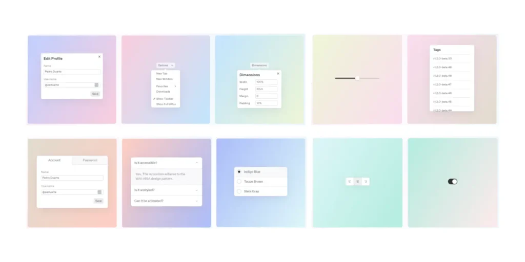
1. Radix Primitives
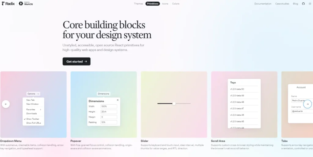
Radix UI is a contemporary component library that offers a wide range of unstyled, accessible React components. Unlike many other libraries, Radix UI emphasizes providing primitives that empower developers to design their interfaces from the ground up. The library comprises four main components to enhance UI development:
- Radix Themes: This library delivers customizable themes that integrate seamlessly with Radix Primitives.
- Radix Primitives: These are the core unstyled and accessible UI components.
- Radix Colors: A selection of thoughtfully crafted color palettes for UI components.
- Radix Icons: A collection of open-source icons designed for use with Radix Primitives or as standalone elements in any React project.
Radix Primitives serves as the foundation of this collection, offering low-level building blocks for creating custom UIs while ensuring accessibility, interactivity, and keyboard support. Built primarily with TypeScript, Radix Primitives boasts over 8.9 million weekly downloads on npm.
Features of Radix Primitives
- Accessibility Focus: All primitives are designed with accessibility in mind, adhering to WCAG standards to ensure usability for everyone.
- WAI-ARIA Compliance: Radix Primitives follow WAI-ARIA guidelines to enhance accessibility.
- Lightweight and Performance-Optimized: The library is designed to be efficient and responsive.
- Sensible Focus Management Defaults: Provides default focus management to improve user experience.
- Consistent API: All components share a similar API for easier integration.
- Independent Versioning: Each component is an independently versioned package, allowing for tailored updates.
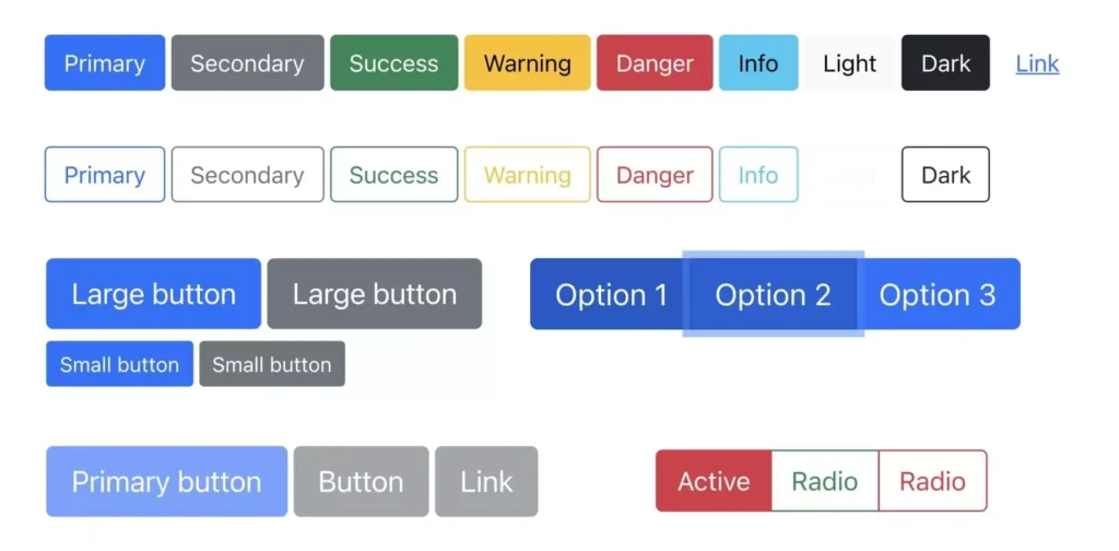
With Radix Primitives, you can concentrate on creating distinctive designs without compromising on accessibility or performance. Below is an illustration showcasing some commonly used primitives, such as dialogs, dropdown menus, and sliders:
2. MUI (formerly Material-UI)

MUI is a simple and customizable React component library built on Google’s Material Design principles. With over 4.1 million weekly downloads on npm, it is composed of 55.8% TypeScript and 44% JavaScript. MUI is more than just a component library; it serves as a comprehensive design system, encompassing a robust set of guidelines, design principles, and best practices for UI design.
Features of MUI
- Extensive Component Library: MUI offers a wide array of React components suitable for various general-purpose development projects.
- Customization Options: You can use existing Material Design components, customize them, or develop your own design system.
- Alignment with Material Design: The library is based on Google’s Material Design system and is widely used across Google’s platforms.
- Google-like Aesthetics: MUI components provide a distinctive Google-like look and feel, making it a strong choice for building Android apps.
- Comprehensive Documentation: MUI includes detailed documentation to assist developers in implementation.
However, it is worth noting that the customization options in MUI can be somewhat limited, which might lead to your app resembling Google’s design language. Despite this, MUI’s popularity and the number of GitHub stars it has garnered make it one of the top UI libraries for React projects.
Notable users of MUI include Medium, Scale AI, and UNIQLO. If you’re considering alternatives, Enlite Prime, mentioned in our guide to the best Material UI themes, is also a commendable option.
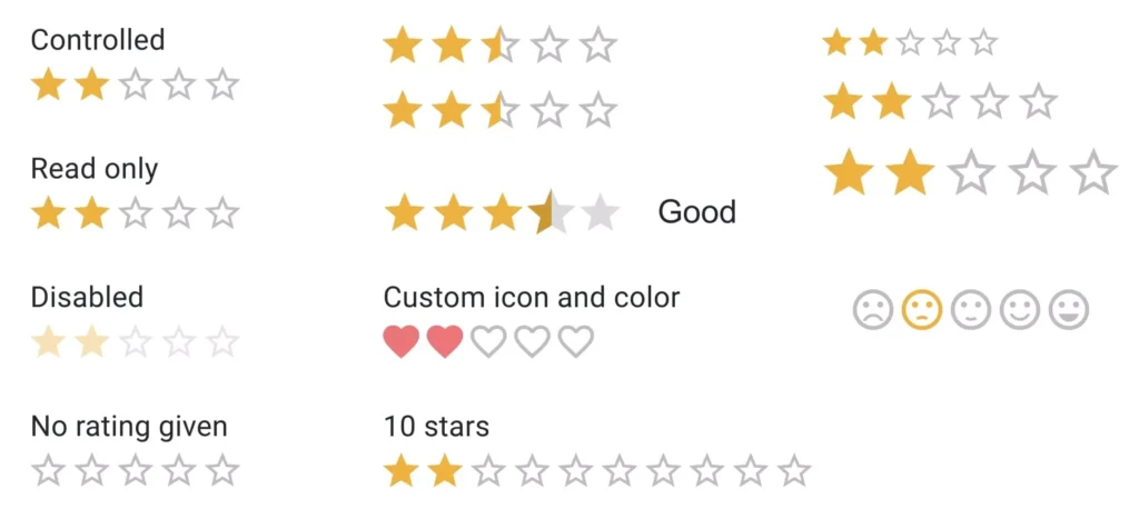
Below is an example showcasing MUI rating variants:
You can install the MUI components library using npm or Yarn:
// npm
npm install @mui/material @emotion/react @emotion/styled

// yarn
yarn add @mui/material @emotion/react @emotion/styled
3. Ant Design
Ant Design is a well-known React UI library developed by Alibaba, boasting over 1.6 million weekly downloads on npm. It positions itself as a design system aimed at enterprise-level users. The library provides a comprehensive collection of high-quality components, enabling developers to swiftly create entire UI frameworks or opt for individual components as needed. Ant Design is constructed with 99.2% TypeScript and 0.8% unspecified code.
Features of Ant Design
- User-Friendly Documentation: Getting started with Ant Design is straightforward due to its extensive documentation, which includes a wealth of guidelines, examples, and component variants.
- Customizability: The library offers a strong platform for modifying existing components and themes to fit specific project needs.
- Integration with Third-Party Libraries: Ant Design is compatible with many third-party React libraries, along with several of its own products, such as AntV Data Visualization, Ant Design Charts, and Ant Design Mobile.
- Tree-Shakable Architecture: While Ant Design may seem bulky at 1.2 MB, it is tree-shakable, ensuring that the production build only includes the components that are actually utilized.
In addition to being utilized by Alibaba, Ant Design is also favored by companies like Lenovo and Toyota, underscoring its suitability for high-level business applications. Its popularity is further validated by its GitHub star count, which surpasses that of React Bootstrap.
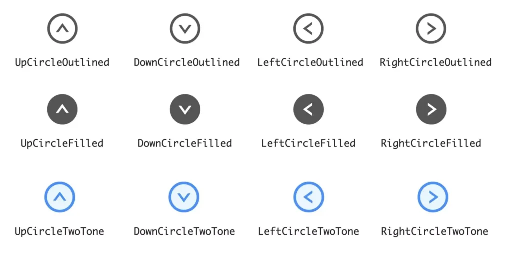
The following image illustrates various icon variants available in Ant Design:
You can install Ant Design components using npm or Yarn:
// npm
npm install antd

// yarn
yarn add antd
4. React-Bootstrap
React-Bootstrap is one of the longest-standing React UI component libraries on GitHub, with over 1.2 million weekly downloads on npm. It serves as a reimplementation of the well-known Bootstrap frontend framework in React. This library is primarily constructed with 65.3% TypeScript and 22% JavaScript. The latest version of React-Bootstrap is compatible with the most recent Bootstrap release, version 5.3.
Features of React-Bootstrap
- Responsive and Accessible Components: The library includes a range of ready-made components that are fully responsive and designed with accessibility in mind.
- Customizable Design Elements: All design components are highly customizable to fit various project needs.
- Versatile Applications: React-Bootstrap can be used as a foundational UI toolkit, for website development, or for designing applications.
- Theme Compatibility: It works seamlessly with thousands of existing Bootstrap themes.
- Custom Theme Creation: Developers can easily create custom themes by utilizing the classes and variants defined in Bootstrap.
- Selective Component Importing: You can import only the components you need, which helps reduce the overall code size.
- Beginner-Friendly: The library is approachable for newcomers and boasts comprehensive documentation.
On the downside, if you’re accustomed to Bootstrap and opt for React-Bootstrap, you’ll need to familiarize yourself with a new API. Additionally, compared to other libraries like MUI or Ant Design, React-Bootstrap offers a more limited selection of components.
Despite these drawbacks, React-Bootstrap’s popularity clearly indicates that it is an excellent choice for a wide range of development projects. For those already familiar with Bootstrap, transitioning to React-Bootstrap can feel intuitive.
The following image illustrates various button variants available in React-Bootstrap:
You can install React Bootstrap using npm or yarn:
// npm
npm install react-bootstrap

// yarn
yarn add react-bootstrap
5. Chakra UI
5. Chakra UI
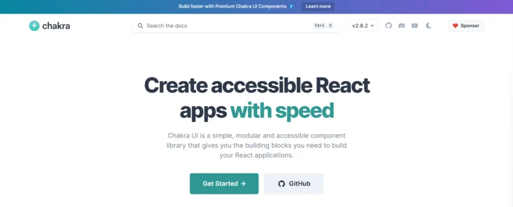
With over 586,000 weekly downloads on npm, Chakra UI provides simple, modular, and customizable React components tailored for web development. The Chakra UI codebase is comprised of 62.1% MDX, 34.8% TypeScript, and 3.1% JavaScript.
Features of Chakra UI
- Dark Mode Optimization: All components are designed to work seamlessly in dark mode.
- WAI-ARIA Compatibility: The library adheres to the WAI-ARIA accessibility standards, ensuring a more inclusive user experience.
- Easy Customization: Customizing components and themes is straightforward, thanks to the use of style props.
- Development Focus: Chakra UI emphasizes the development process, promising that you’ll spend less time coding and more time enhancing the user experience.
- Comprehensive Documentation: The library offers solid documentation to assist developers.
However, Chakra UI may fall short in certain features and components compared to libraries like React-Bootstrap. As a result, it is best suited for small to medium-sized development projects that require only a limited number of components or advanced functionalities.
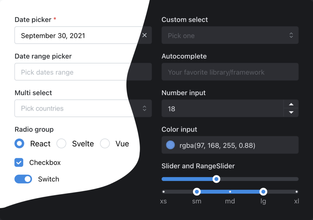
The image below displays examples of checkbox variants available in Chakra UI:

You can install Chakra UI and its components using npm or Yarn:
6. Mantine
6. Mantine

Mantine is a widely used React component library, boasting over 500,000 weekly downloads on npm. It offers more than 100 customizable and accessible components, hooks, and utilities designed for building modern web applications. The library fully supports TypeScript and integrates seamlessly with popular CSS-in-JS libraries. The Mantine codebase consists of 79.9% TypeScript, 15.1% MDX, and 4.9% CSS.
Features of Mantine
- Free and Open Source: Mantine is freely available for use and modification.
- Diverse Component Set: The library includes a wide range of components, from fundamental UI elements like buttons to more intricate features such as notifications and modals.
- Type Exporting: All components and hooks export their types, enhancing type safety and developer experience.
- Framework Compatibility: Mantine supports all modern frameworks, including Next.js and Remix.
- Flexible Theming System: It offers a highly customizable theming system for tailored designs.
- Dark Mode Support: Dark mode functionality is built-in, allowing for a smooth user experience.
With over 200 contributors and a rapidly growing user base, Mantine stands out as a robust option for contemporary React development. The image below illustrates some popular components from Mantine:
You can install Mantine using npm or Yarn:
// npm
npm install @mantine/core @mantine/hooks

// yarn
yarn add @mantine/core @mantine/hooks
7. Shadcn
7. Shadcn
Shadcn is a relatively new React component library that has quickly gained traction, amassing over 84,000 weekly downloads on npm since its launch just a year ago. Built on top of Radix Primitives, Shadcn features unstyled components that prioritize accessibility, enabling developers to apply their unique styles as needed. The library is composed of 91.4% TypeScript, 7% MDX, and 1.1% CSS.
Features of Shadcn
- Full TypeScript Support: Shadcn offers comprehensive TypeScript integration, ensuring robust type safety for developers.
- Highly Composable Components: The components are designed for high composability, allowing for flexible UI construction.
- Unstyled Components: Since the components are unstyled, they are easily themable, giving developers complete control over the appearance.
- Compatibility with Animation Libraries: Shadcn works seamlessly with popular animation libraries, enhancing user experience.
- Tree-Shaking: The library employs tree-shaking, which ensures that only the components utilized are included in the final bundle, optimizing performance.
- Utility Hooks: Shadcn includes utility hooks to simplify state management and manage UI interactions effectively.
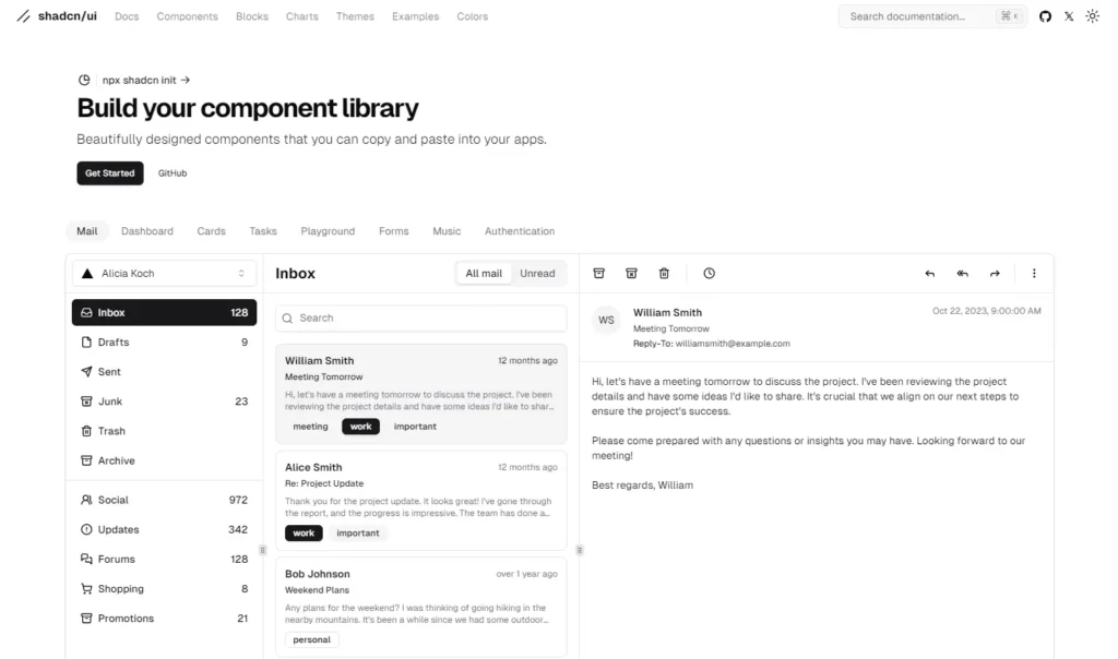
Shadcn is an excellent choice for developers looking to create accessible, flexible, and high-performance user interfaces while maintaining full control over styling and theming. The image below showcases an example of Shadcn mail components:

You can get started with Shadcn using npm or Yarn:
// npm
npm install shadcn-ui

// yarn
yarn add shadcn-ui
8. Reactstrap
8. Reactstrap
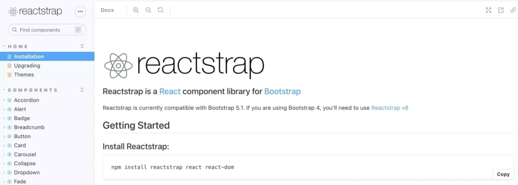
With over 484,000 weekly downloads on npm, Reactstrap provides a collection of straightforward and self-contained components tailored for Bootstrap 5.1. Its UI elements are responsive and feature a simple design, making them suitable for a wide range of projects. The Reactstrap codebase consists of 82.4% JavaScript, 16.5% TypeScript, and 1.1% unspecified code.
Features of Reactstrap
- Complete or Component-Based Development: Reactstrap can be utilized for full UI development or for selecting individual components as needed.
- Flexibility and Validation: The library offers great flexibility and built-in validation, facilitating the rapid creation of user-friendly forms.
- Beginner-Friendly: With its straightforward approach, Reactstrap is easy for beginners to get started with.
- Active Community: There is a decent community surrounding Reactstrap, providing support and resources.
- Theme Options: Many free and premium Reactstrap themes are available, helping to accelerate your development process.
Overall, Reactstrap is quite similar to React-Bootstrap, with minor differences. If you are comfortable working with Bootstrap, either library can be a suitable choice for your project.
However, as a relatively newer component library, Reactstrap has a smaller collection of components compared to some other options listed here. This could be advantageous if you’re aiming for a more minimalistic design. While the official documentation is thorough, it primarily consists of code examples with limited explanations.
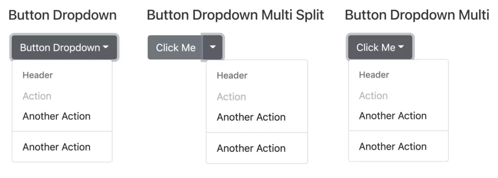
The image below illustrates an example of button dropdown variants in Reactstrap:
To use Reactstrap, you first need to install Bootstrap:
// npm
npm install bootstrap

// yarn
yarn add bootstrap
Then you can install Reactstrap using npm or Yarn:
// npm
npm install reactstrap react react-dom

// yarn
yarn add reactstrap
9. Semantic UI React
9. Semantic UI React
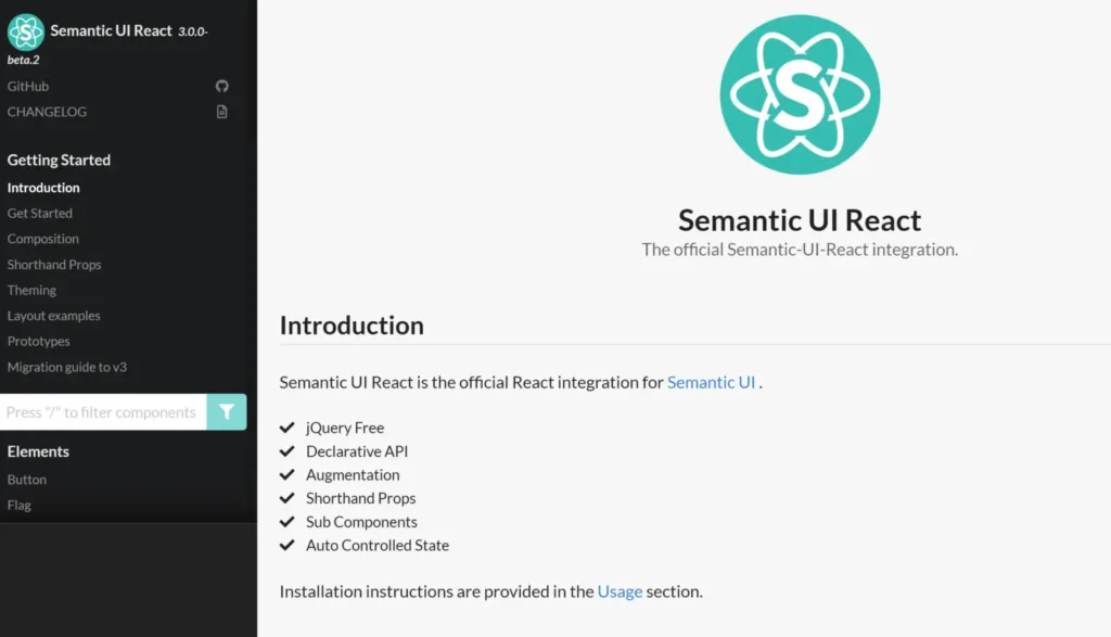
With over 266,000 weekly downloads on npm, Semantic UI React is a frontend component library designed to provide ready-made, mobile-responsive solutions. As the name implies, it serves as the official React integration for the Semantic UI development framework, which is known for its responsive and human-friendly HTML code. The library is constructed using 99.9% JavaScript and 0.1% TypeScript.
Features of Semantic UI React
- Component Variations: The Semantic UI React library offers multiple variations for each component, ensuring you can likely find a suitable option for your specific use case.
- Customization: Each component can be customized to align with your design by modifying the SCSS stylesheets.
- Modular Usage: You have the flexibility to use the entire Semantic UI React library for your project or to install only the individual components you need.
- Web Focus: Originally designed for web development, Semantic UI React is better suited for web applications than for mobile app projects.
However, it’s important to note that the original Semantic UI framework is no longer actively maintained, and not all components are fully accessible by default.
Despite this, Semantic UI React remains a strong choice for beginners looking to create responsive web applications. It features human-readable code, excellent documentation filled with examples, and a code sandbox for each component.
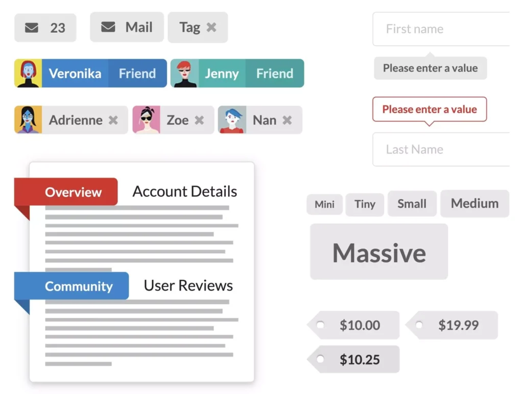
The image below displays an example of label components in Semantic UI React:
You can install Semantic UI React components using npm or Yarn:
// npm
npm install semantic-ui-react semantic-ui-css

// yran
yarn add semantic-ui-react semantic-ui-css
After install, import the minified CSS file in your app’s entry file:
import 'semantic-ui-css/semantic.min.css'
10. Blueprint
10. Blueprint

With over 181,000 weekly downloads on npm, Blueprint boasts a library of more than 40 modern components. Its primary focus is on creating a React UI for complex, data-dense desktop applications, making it less suitable for fully mobile-responsive designs. The library is constructed using 89.1% TypeScript, 7.6% SCSS, 2.7% JavaScript, 0.3% Shell, and 0.2% HTML.
Features of Blueprint
- Modular Installation: Blueprint allows you to install the core package containing fundamental components, with the option to add additional component packages as needed, such as Datetime, Icons, and Table packages.
- Optimized Imports: You can import only the components necessary for your project, helping to optimize the bundle size.
- Theming Options: The library offers a default light theme and a dark mode theme, but no additional prebuilt themes are available.
- Customization: Blueprint provides significant customization capabilities, enabling you to modify classes, color themes, and typography to suit your needs.
- Detailed Documentation: The library comes with comprehensive and well-organized documentation.
Blueprint is an excellent choice for developers looking to build data-dense desktop applications with aesthetically pleasing, pre-made components. However, similar to Theme UI and Rebass, its community is still relatively small, which may make finding support more challenging. Additionally, it is not particularly suited for mobile applications.
The image below illustrates an example of icon variants in Blueprint:
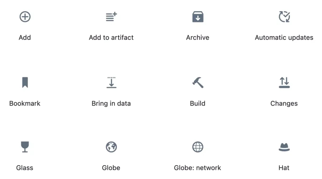
You can get started with Blueprint’s core components and install them using npm or Yarn:
// npm
npm install @blueprintjs/core

// yarn
yarn add @blueprintjs/core
Create Unique Designs by Utilizing a React UI Component Library
Create Unique Designs by Utilizing a React UI Component Library
Building an application becomes much easier with ready-made React UI components. By tailoring these components to meet your specific needs, you can quickly create a unique design without starting from scratch.
Here’s a brief overview of suitable use cases for the libraries discussed in this article:
- If you need a wide variety of prebuilt components along with excellent documentation, consider MUI, Ant Design, Semantic UI React, Blueprint, and Mantine.
- For mobile app development, MUI, React-Bootstrap, and Ant Design are great options. These libraries can be used for both Android and iOS applications, though MUI is more suited for Android.
- Blueprint is particularly effective for desktop applications that require handling large amounts of data.
- If out-of-the-box accessibility is a priority in your React project, MUI, React-Bootstrap, Chakra UI, or Blueprint should be on your radar.
- React-Bootstrap and Reactstrap offer good compatibility with Bootstrap themes.
- For basic components, check out Radix Primitives and Shadcn.
We encourage you to explore the most popular React UI component libraries mentioned in this post. They will help you jumpstart your React app or web development project.
FAQs About React UI Component Libraries and Material UI
FAQs About React UI Component Libraries and Material UI
What Is a React UI Component Library?
A React UI component library is a set of pre-designed, reusable user interface elements (components) that facilitate the development of web applications using React. These libraries offer a consistent and efficient approach to creating user interfaces with React.
Why Should I Use a React UI Component Library?
Utilizing a UI component library can save both time and effort in UI development by providing ready-made, thoroughly tested components that adhere to best practices. This ensures a uniform look and feel throughout your application and can accelerate the development process.
What Are Some Popular React UI Component Libraries?
Popular React component libraries include MUI, Ant Design, Radix Primitives, Mantine, Shadcn, React-Bootstrap, and Chakra UI, among others.
Are React UI Component Libraries Compatible with State Management Libraries Like Redux or MobX?
Yes, React UI component libraries are compatible with various state management solutions. You can seamlessly integrate them into your application, regardless of the state management library you decide to use.
Are UI Component Libraries Mobile-Responsive?
Yes, most React component libraries are designed to be responsive, ensuring that the components adapt well to different screen sizes, including mobile devices and tablets.
What Is Material-UI, and Why Should I Consider Using It in My React App?
Material-UI is a widely used open-source library that provides a collection of customizable, high-quality React components based on Material Design guidelines. It enables you to create visually appealing and responsive user interfaces swiftly.
How Do I Get Started with Material-UI in My React Application?
To begin, you can install Material-UI using npm or yarn. After installation, you can import and utilize Material-UI components in your React application.
How Do I Customize the Appearance of Material-UI Components to Match My App’s Design?
Material-UI offers extensive theming support. You can create a custom theme using the createTheme function and override theme variables to align with your app’s design. In newer versions, consider utilizing the sx prop or the styled API for more advanced styling options.
Can I Use Material-UI Components in Conjunction with My Own CSS Styles?
Yes, you can combine Material-UI components with your custom CSS styles. Material-UI components allow you to pass className and style props, enabling you to apply your own styles alongside Material-UI’s styling.
Can I Use Multiple React UI Component Libraries in the Same Project?
Yes, it is possible to use multiple React component libraries within the same project. However, you should be cautious about potential styling conflicts, variations in design principles, and an increase in bundle size.
What Are the Main Differences Between React-Bootstrap and Reactstrap?
Both React-Bootstrap and Reactstrap provide components based on Bootstrap. React-Bootstrap is a more mature library with a larger community, while Reactstrap is lighter and more flexible.
Can I Customize Themes in React UI Component Libraries?
Yes, most React UI component libraries allow for a certain level of theme customization. For instance, libraries such as MUI, Ant Design, Mantine, Chakra UI, Radix Primitives, and Shadcn offer extensive theming capabilities and tools for customizing components.